Miguel Rivera
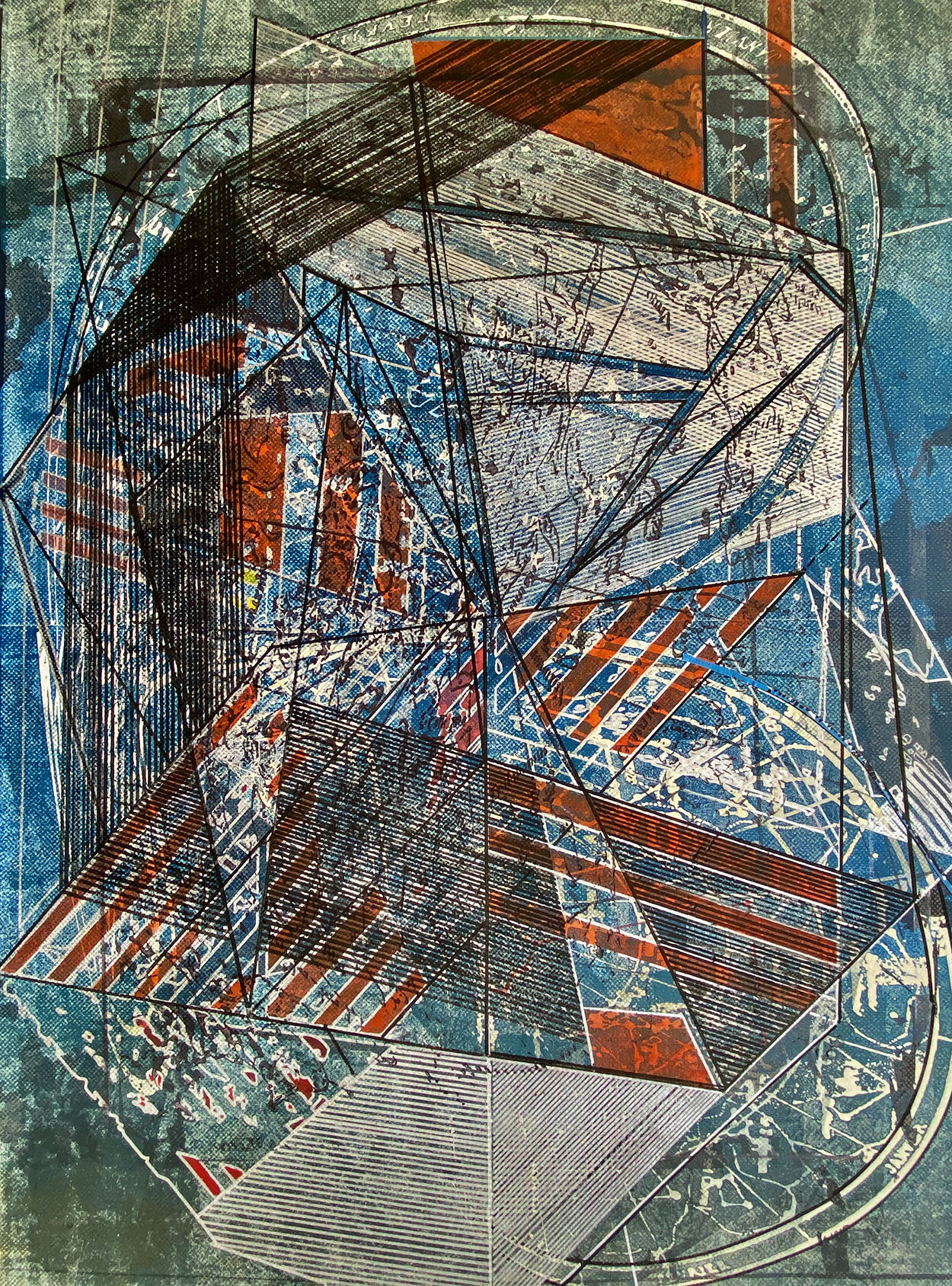
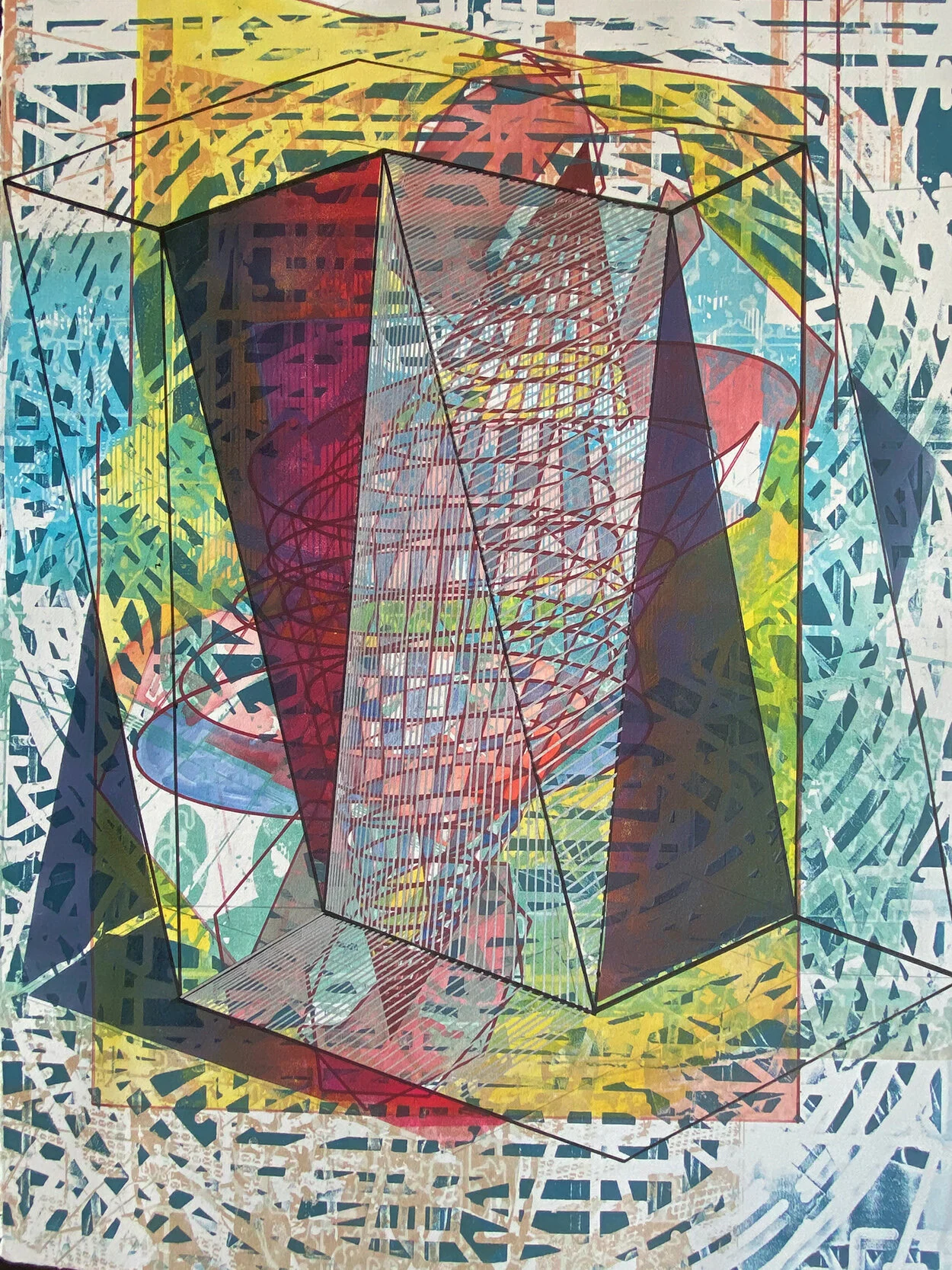
Piscis, Mixed media on paper, 2020, 16 x 12"
“My work explores the overload of information problem by superimposing color images upon color images. The visual effect may be exactly the same narrative I see in our complex everyday world.”
Miguel Rivera-Ortega is an artist living and working in Kansas City Missouri (USA). His approach to color is informed by his interest in Latinamerican identity history, and his approach to printmaking is non-linear and complex. His multilayered expanded media work is created with intaglio, relief and lithographic printmaking techniques as well as digital tools such as laser and CNC technology. Currently Miguel is working on a series of works on paper addressing religious architecture, mapping and how they are used to instill colonialism.
The technical aspects of Miguel’s work includes researching a process using routers and lasers to create singular non-printable matrices on clear materials. He says, “The matrices will be the final products and will function as the matrix and the substrate using color resin instead of printing ink. After working the last series of works taking the printmaking structure to alternative materials, I think trying clear plastics and resins will help me reveal the beauty of hidden layers in past works.”
Are there specific associations towards color in your work?
I like reading historical novels that explain our lack of understanding of our origins. I am gravitating to the fascinating history of the early American colonies (the entire American continent).
I enjoy authors like Charles Mann and Karen Armstrong and the way they narrate conflict in great detail. Mann explains the fascinating history of how produce and raw materials from the Americas helped revive a decadent Europe in the 1500s. Red colors from tomatoes, shiny metals, yellow from potatoes, browns from chocolate and turquoise greens from stones and birds represented the “exotic” new world. I find myself gravitating around these analogies in my own work.
“I believe that natural light in most of Central America and South America informs and influences artists to adopt the natural chromatic environment available to them.”
Untitled, Mixed media, 30 x 22" (in progress)
Untitled, Mixed media, 30 x 22" (in progress)
What are the references, research, or aspects of history that your work includes?
My direct references are images that represent my concern with identity and cultural history. Memory for me is the recollection and use of graphic images of places I have lived in. One of my personal interests is the pathos of Catholic cathartic images found in Mexican catholic churches, especially those illustrating physical suffering in saints and crucifixes. I also like to include maps as drawing structures to segment my otherwise chaotic images.
In a broad context, I am also reacting to the western perception of Latin American art of being eloquent, exotic and bright. Although these perceptions are in part true, I also believe that natural light in most of Central America and South America informs and influences artists to adopt the natural chromatic environment available to them.
This was the case with the muralist movement like Siqueiros, Orozco and Rivera and the architect Luis Barragan who would collect samples of the local flora to match the colors in his house installations. I use this approach since it helps me to select and identify color choices for my own work under a different local light.
What can printmaking ink achieve regarding color in your work that no other material can?
I took a series of drawing and painting courses in Mexico and in Oregon in tandem with my printmaking major studies. After a series of frustrated attempts to paint a transparent flat red on a painting, which was necessary for the subject matter, I came to the realization that printmaking ink provided the right path to achieve perfect layers of flat or translucent colors that I could not achieve in any other way. I understood that rolled ink and pressure was the perfect approach to my goals then.
Lately my work explores the overload of information problem by superimposing color images upon color images. Some images or layers may be hand drawn on a plate or directly on paper and some others may be mechanically produced also on the same surface. It may take 8 to 12 colors to make a single image at the end. The visual effect I see at that point may be exactly the same narrative I see in our complex everyday world. I believe that color has become part of my narrative which was predominantly B&W for a long time.
What colors or color palette do you usually recall when you dream?
According with Robert J. Ross M.S., the vast majority of humans dream in color. For me it is sepias and greens. I remember a lot of city sodium lights with these hues from my first memories in my hometown, Guanajuato.
Untitled, Mixed media, 30 x 22" (in progress)
Orion, Mixed media on paper, 2020, 12 x 16"


