Camilla Taylor
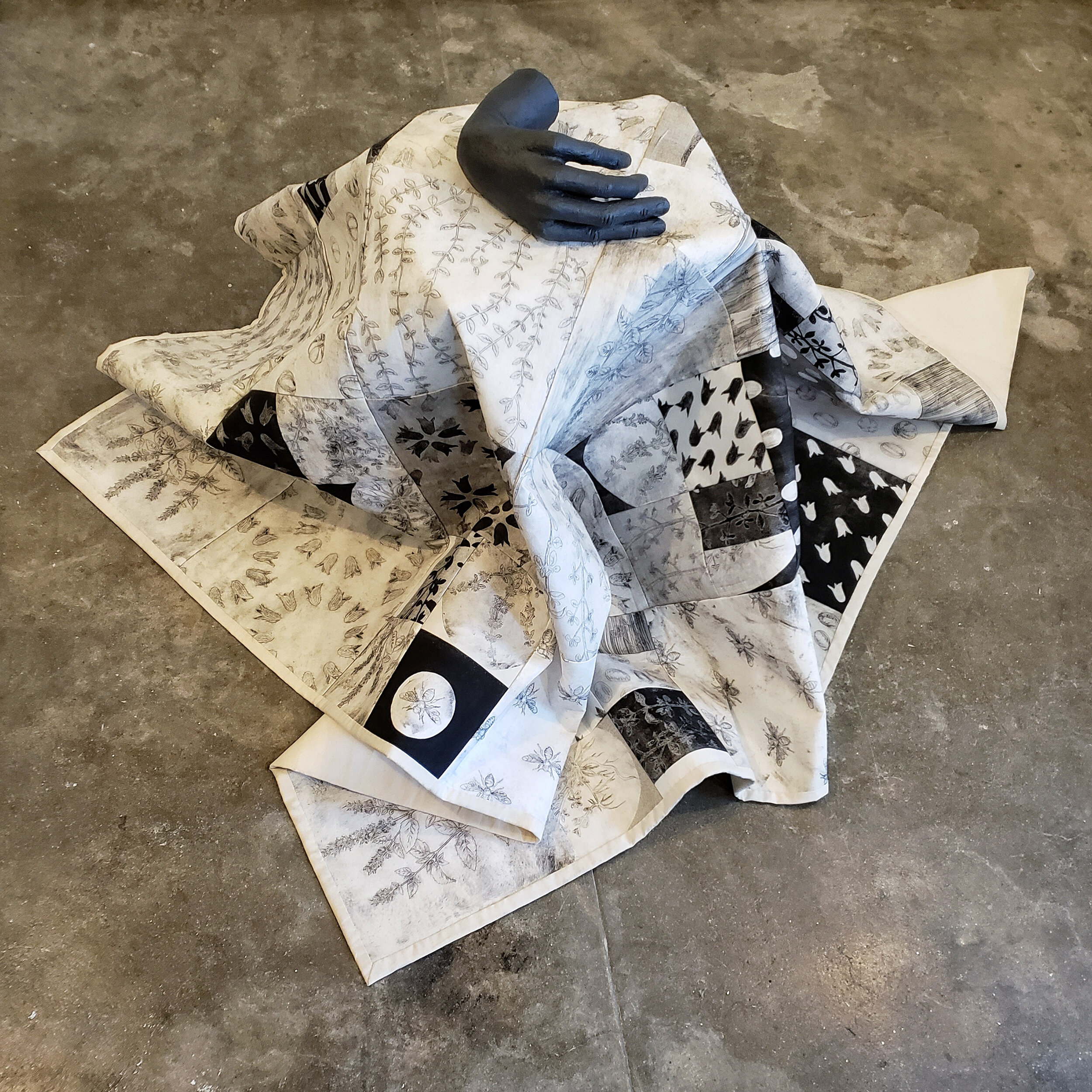
Soil, Monoprint on found fabric, ceramic with underglaze, 48 x 24 x 24 inches, 2019.
This is the first quilt I’ve ever made, and I’ve completely fallen in love with the process of printing the fabric before making a quilt from it. Quilting is already a language of symbols, a physical object like a sculpture that’s also read like a picture. The quilt interacting with a ceramic or glass object adds this additional layer of care, distorting the printing while activating the quilt.
“The lack of loud colors brings you inside yourself, as my work is most often referencing an interior experience.”
Camilla Taylor is an artist living and working in Los Angeles, California (USA). Her approach to color is subtle and limited to a palette of blacks, greys and graphite, and her approach to printmaking is generous and experimental. Camilla’s figurative and monochromatic work, which references interiority, is created with intaglio, relief and monoprint printmaking techniques and she also works with ceramic, glass, metal, fiber and installation.
Currently Camilla is preparing work for the upcoming Spring Break Art Fair in New York with Track 16 Gallery. She is also working on a series of small prints that deal with folding chairs, a mundane object that references the specific experience of attending Mormon churches, and making large scale quilts made with etchings for an upcoming solo exhibition in 2022.
Darius, Camilla, Joseph, Drypoint intaglio monoprint, 10 x 8 inches, 2020.
Part of a series about deception, each of the portraits is of a liar who deceived for reasons other than money. The drypoint plates are wiped only partially, the liar reinventing themselves each time they tell a new version of their life.
How does color represent or support the mind space of your work?
I have a mild synesthesia—some colors are loud and obnoxious. Black is a soft silence, without the complications of experience that other colors bring. Black can be like that time between being awake and falling asleep, a state of openness and vulnerability.
The lack of loud colors brings you inside yourself, as my work is most often referencing an interior experience. My goal is for my artwork to feel familiar, like something you can’t quite place but know you’ve experienced it before, the interior life of a person. All of those pieces that live inside, the parts that one identifies as the “self” and then all the rest–motivations, memories, prejudices, that make up a person–all existing together.
“Drawing out a ribbon of black ink with a palette knife on the glass, slowly building it up on a plate with a roller, and the velvety depth of a solid black when printed—ah, I was so taken with it.”
One to the Other, Ceramic with underglaze, 4 x 12 x 12 inches, 2020.
This work communicates well how printmaking has imbued itself into how I approach all other artforms: reproduction and repetition. A grid of an editioned print laid out to dry is something I refer back to over and over, what a thing says about itself when it’s repeated over and over with small changes.
How does the printmaking process itself relate to how you work with color?
When I took my first printmaking classes, we were only allowed to use black ink, it’s almost like the first language. Drawing out a ribbon of black ink with a palette knife on the glass, slowly building it up on a plate with a roller, and the velvety depth of a solid black when printed—ah, I was so taken with it. Then slowly we could introduce more color alongside more complexity in process.
I certainly enjoyed the ease that using color lent to making art, but as I slowly limited my palette I became more and more certain that the initial language of blacks was the most suited to my goals. I’m not purely a printmaking artist, but that sensibility has affected the subsequent media I worked with, that first language of black on white and its subtleties.
Speaking Unison, Telling Their Own Lies, Ceramic with glaze, thread, monoprint on found fabrc, found table, 48 x 36 x 36 inches, 2020.
The heads are all mold made, a bit like printing, sitting atop a table cloth I printed with a pattern of mock orange flower. This is from an exhibit about deception, and mock orange symbolizes lies in some European languages of flowers.
What cultural aspects of color are built into your work?
I’ve tried very hard to limit cultural associations with color, and though I’ve been encouraged often by collectors and gallerists to include color (red or pink come up most often) I never do, because they say too much just on their own—I can’t control them. And I’ve always thought that I was very successful at this. But someone once mentioned that they were reminded of the ill-fitting black suits of men attending church, and immediately I knew that must be part of it.
Shame, Monoprint on found fabric, ceramic, 48 x 24 x 24 inches, 2020.
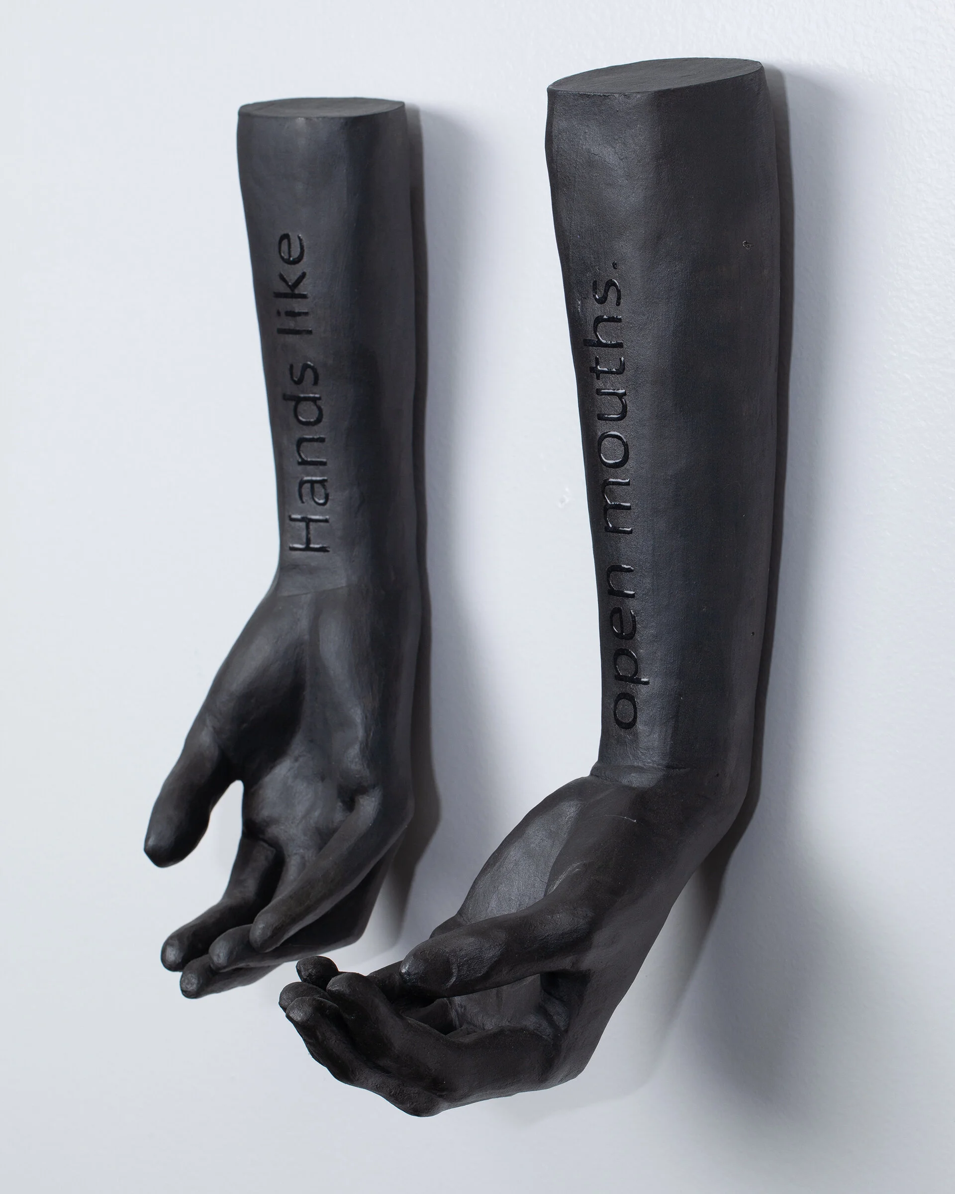
An Appetite, Ceramic with glaze and underglaze, screenprint, 14 x 8 x 5 inches, 2020.
The text is easy to miss on this one, it’s the same color as the rest of the piece, just glossy instead of matte. I hope that only some people end up reading it, a little reward for those who spend the extra time with an artwork.
What color do you wish you could buy? Why this color?
Something both reflective and glossy, but also velvety and matte. A color that for a moment reflected the viewer back to themselves but then next moment retreated back to flatness. A color that keeps itself from you, but lets you know that it’s doing so.
Braid, Loosening Braid, Gathered Hair, Sintracut (relief) on kozo, 32 x 8 inches, 2018.


