Amber Heaton
Countdown - Ten, 2017, Woodcut, 10 x 10 inches
“I use color to compose spatial relationships with psychological tension and release.”
Amber Heaton is an artist living and working in Brooklyn, New York (USA). Her approach to color is optical, and her approach to printmaking is systematic. Amber’s geometric and abstract works are created with relief and letterpress printmaking techniques. She also makes paintings, sculpture and installations. Currently Amber is creating a new body of mixed media works combining painted wood and string.
How does color represent or support the mind space of your work?
Like Byzantine architecture and mandala drawings, my work lies in the tradition of creating spaces that embody the sensation of the sacred or mystical. Compositionally, I want each work to come to a state of equilibrium, and to emanate a sense of calm and openness.
Color is an essential tool in building the visual spaces in my work. As gradients and patterns interact, color acts as a harmonizing force, a playful energy, or a vibrating field. I use color to compose spatial relationships with psychological tension and release. These psychological spaces give me room to consider human interactions in a visual way, and my geometries become metaphors for those interactions.
Counterpoise, 2015, Woodcut, 10 x 8 inches
“Like all printmaking, there is a lot of organization behind the scenes, but printing becomes a really fun puzzle to solve.”
Flipped Square, 2018, Woodcut, 10.5 x 13.25 inches
If you could eat a color for dinner, what color would you choose and how would it taste?
I would eat the violet blue color of the sky at dusk as the light fades.
Just as the sun sets, it tastes crisp and fresh with a delicate citrus tang. The shade mellows into a savory tender warmth that melts on the tongue, then deepens into a chocolatey bittersweet drip. And as the light slips away into darkness, a hint of spice lingers on my lips.
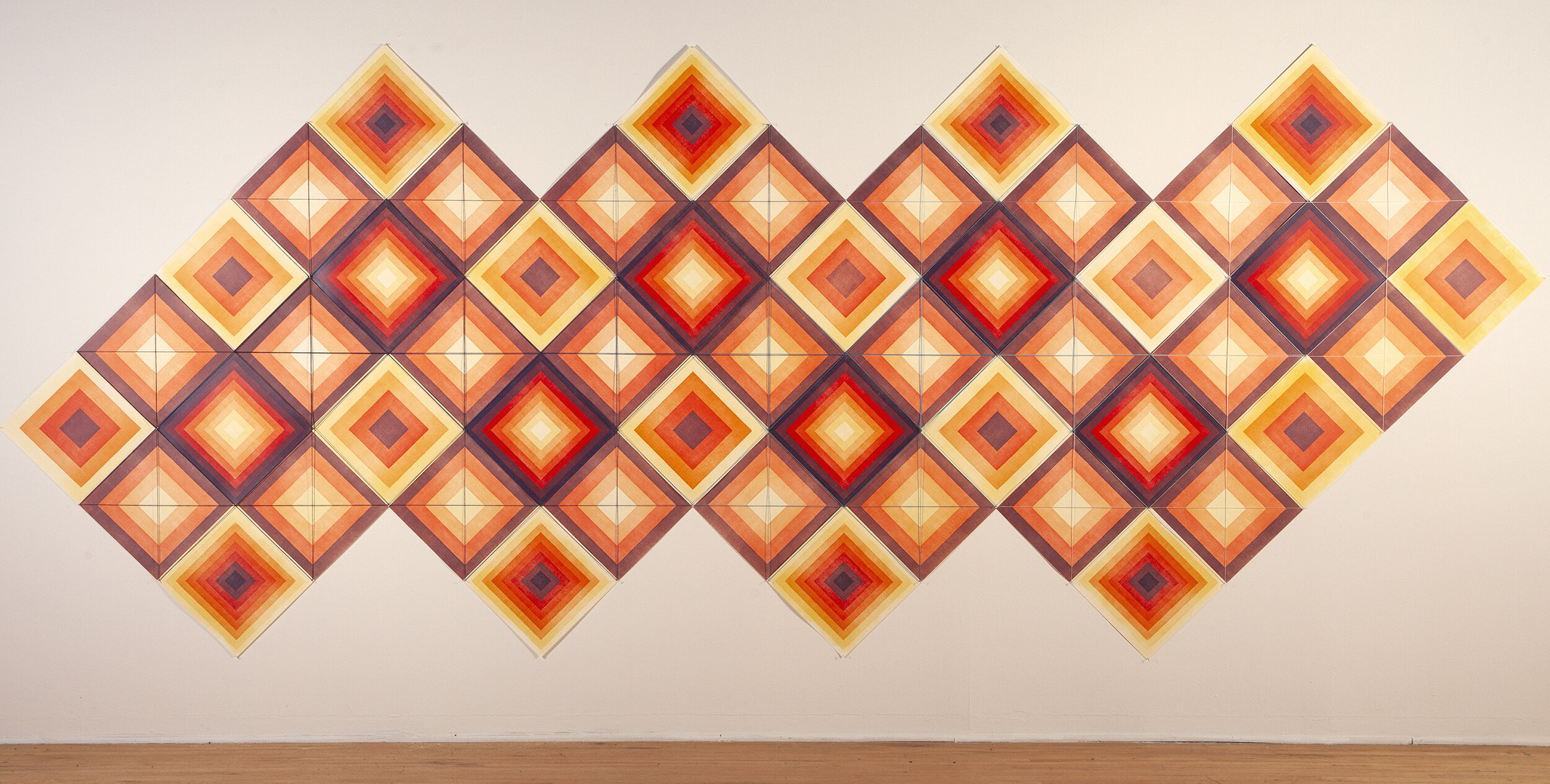
Spiritum, 2018, 52 woodcut prints, 210 x 44 inches
How does the printmaking process itself relate to how you work with color?
One of the great strengths of printmaking is the ability to build up many layers of thin transparent ink. I compose shapes and patterns using gradients of color, and printmaking lends itself to this activity nicely.
In relief printing, it is easy to work reductively. As I carve and print and carve and print again, I feel so satisfied watching an image take shape. If I am patient enough, I can build a world of subtlety with very graphic shapes and gentle color mixing. It takes time, but I still feel excited each time I run that next layer through the press.
I mostly print woodcuts on a flatbed letterpress. This allows me to tightly register blocks in different locations of the press bed easily. I can print the same shape in various locations on a sheet, and register it again in all the same locations as I carve the block several times. For geometric work, this really opens up the possibilities for tessellations and pattern building using smaller pieces of wood. Like all printmaking, there is a lot of organization behind the scenes, but printing becomes a really fun puzzle to solve.
Countdown, 2017, Set of 10 woodcut prints, 10 x 10 inches each


