Sarah Smelser
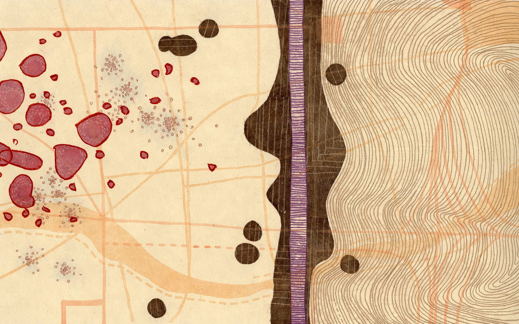
Thanks to Tamarind III, 2020. Monotype, 10" x 16"
“Without color, my work would exist, but it would be deadly boring to look at and make.”
Sarah Smelser is an artist living and working in Bloomington, Illinois (USA). Her approach to color is intuitive, and she has an old-school approach to printmaking. Her abstract, elegant and contradictory work is created with trace monotype methods along with T.L.C. Currently Sarah is working on a suite of works titled Morning Walk.
How does color represent or support the mind space of your work?
I learned printmaking using only black ink and was fulfilled by that well into graduate school. In the summers between academic years, I went to New York and printed for other artists. I met my partner and started living an adult life. I worked on a small scale, six-by-six inches, so I could transport my work back and forth on the subway between my apartment and a what was then Bob Blackburn's Printmaking Workshop. I used the presses there and when I went back to my apartment I wanted to keep working.
Without ink, I sewed on my images. Thread satisfied my need for a line with presence. However, black thread wasn't that interesting. I bought some red thread and had a small revelation. Black and red have the same authority, the same punch, the same chutzpah.
I started adding red ink into my print process and then turned to yellow ink. It took me many years to expand my palette, or even want to. Color represents the mind space of my work because it brings me immense joy, encourages me to teach myself, and takes me on a different journey every time I enter my studio. Color is not the backbone of the work, but it can be a starting point, an incentive, a surprise, or a treat.
Morning Walk II, 2019, Monotype, 16" x 20"
“Using color means making the right one for each situation, and that is very much about intuition, taste, perspective, and association.”
Thanks to Tamarind II, 2020, Monotype, 10" x 16"
Where do you reside between technical and intuitive in your work as an artist using color?
When I was an undergraduate student, my printmaking teacher waived my color theory requirement so I could take more printmaking courses. I truly regret not having learned about color in an academic setting. Whatever I know about color has been from self-assigned reading, other artists, mistakes in the studio, and moments of victory.
Perhaps if I had taken a color theory course, I would approach color from a position of technical know-how. However, I doubt I would enjoy using color as much. I think through color and work responsively. I make colors through trial and error, and I often find a different color along the way that I prefer. Using color means making the right one for each situation, and that is very much about intuition, taste, perspective, and association.
What would your work be without color?
I used to think that color was a crutch and, at times, I have tried to go back to the basic, classic, black and white print. I can't do it. I admire and envy artists who work with only black ink, and I own many black and white prints made by other people. I love to look at them, but I cannot make them anymore.
As my work transitioned into being colorful, I forgot the language of black and white printmaking and I simply cannot relearn it. Perhaps I'm not trying hard enough, but I enjoy what I do. Why torture myself? I would like to make a suite of works using different permutations of black: warm, cool, transparent, etc. but even that would use color to a certain extent and would have to be done at a residency. A residency has a clear starting and stopping point, and I would need boundaries for such a project. It would be real WORK, whereas working with color now comes very naturally to me and never feels arduous.
Without color, my work would exist, but it would be deadly boring to look at and make. I would work more slowly and worry in the studio. I would be a different person.
Morning Walk III, 2019. Monotype 16" x 20"


