Karen Lederer
Blue Note, watercolor monoprint, 21.25 x 29.25 inches, 2019, photo by Christian Nguyen.
“Embracing the mystery of the process means relinquishing some control.”
Karen Lederer is an artist living and working in Brooklyn, New York (USA). Her approach to color is intuitive and her approach to printmaking is experimental and painterly. Karen’s still-lifes, made with monoprinting techniques, emphasize the role of curation, artistic influence, consumerism, point-of-view and aesthetics in our daily life.
Currently she has a solo show of prints and paintings, “Afternoon Sun”, up at Cheymore Gallery in Tuxedo Park, New York. In the new year, she will be showing paintings in a group show “Lush” at Hashimoto Contemporary in New York and paintings and prints in a group show “Just what is it…?” at Cristea Roberts Gallery in London.
Where do you reside between technical and intuitive in your work as an artist using color?
When I teach monoprinting workshops, I always emphasize experimentation to my students. If they are curious about whether something will work, I encourage them to try it. Because of that approach, I’ve gotten to see so many new and interesting ways to play with color and printmaking materials. For example, I had a scientist in a class that decided to shave watercolor crayons onto the plate and print it. The resulting texture and color were fascinating.
Sometimes I will take these experiments, and work with them until I understand what they can do. The artwork starts off intuitively, but then is harnessed by a technical understanding of the medium. I think it’s important to take chances when printing and follow instincts. Embracing the mystery of the process means relinquishing some control. Every print won’t be a winner, but each one usually teaches me something that I can apply to the next one.
“I like to print with watercolors. When they are printed, they look forever wet, juicy, and bright.”
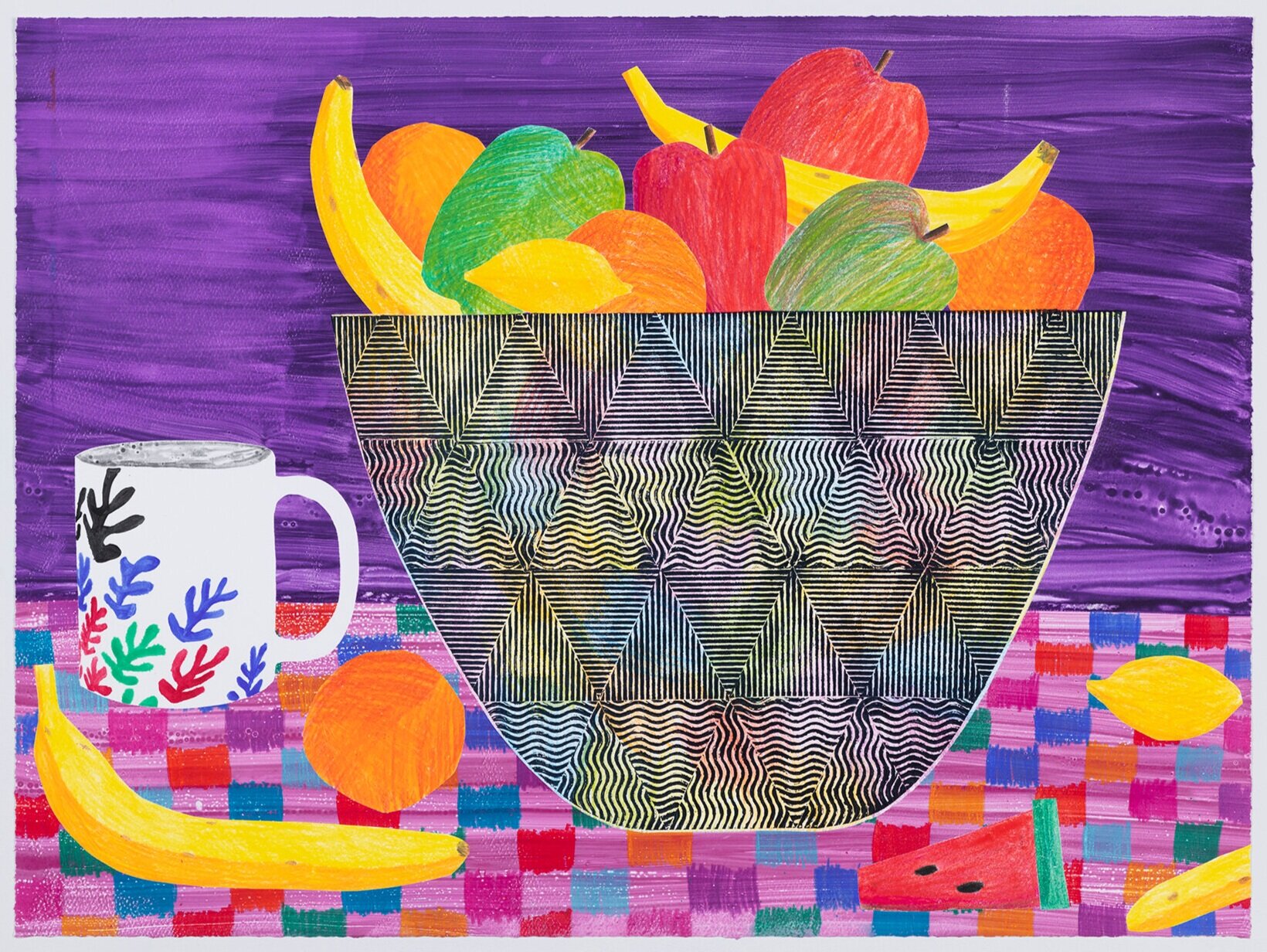
Purple Fruit, monoprint, 21 x 29 inches, 2020, photo by Christian Nguyen.
How does the printmaking process itself relate to how you work with color?
Often, when I’m making prints, I’ll start with a loose idea of what I am going to make but don’t have a clear plan. I arrive at the printshop with some stencils and hand-drawn plates, but then I work fairly intuitively to build the print.
I paint directly onto Plexiglas with watercolor paints and then layer additional plates on top before sending it through the press. I will also ink up a bunch of stencils with oil-based ink. Once I’ve made the first print, I often have stencils left over for another print. I will look at what I have, and the different colors, and allow that to dictate what I make next.
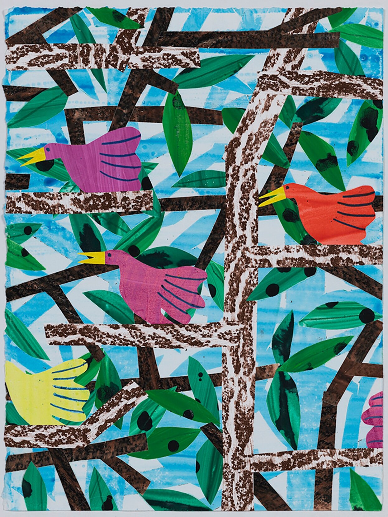
Aspen Birds, watercolor monoprint, 14 x 11 inches, 2019, photo by Christian Nguyen.
William with Fish, waterbased monoprint, 20.75 x 28.5 inches, 2019, photo by Christian Nguyen.
What can printmaking ink achieve regarding color in your work that no other material can?
Printmaking ink is so luminescent and rich! I love to use charbonnel etching ink which I think makes the most beautiful color possible. The ink blends seamlessly to make gradients.
I have not been to the printshop since March because of the pandemic, and I haven’t found a way to recreate the brightness and openness of the color through any other material in my personal studio.
I also like to print with watercolors. The paints look completely different when printed as opposed to being applied directly onto the paper with a brush. When they are printed, they look forever wet, juicy, and bright.


