Julie Alpert
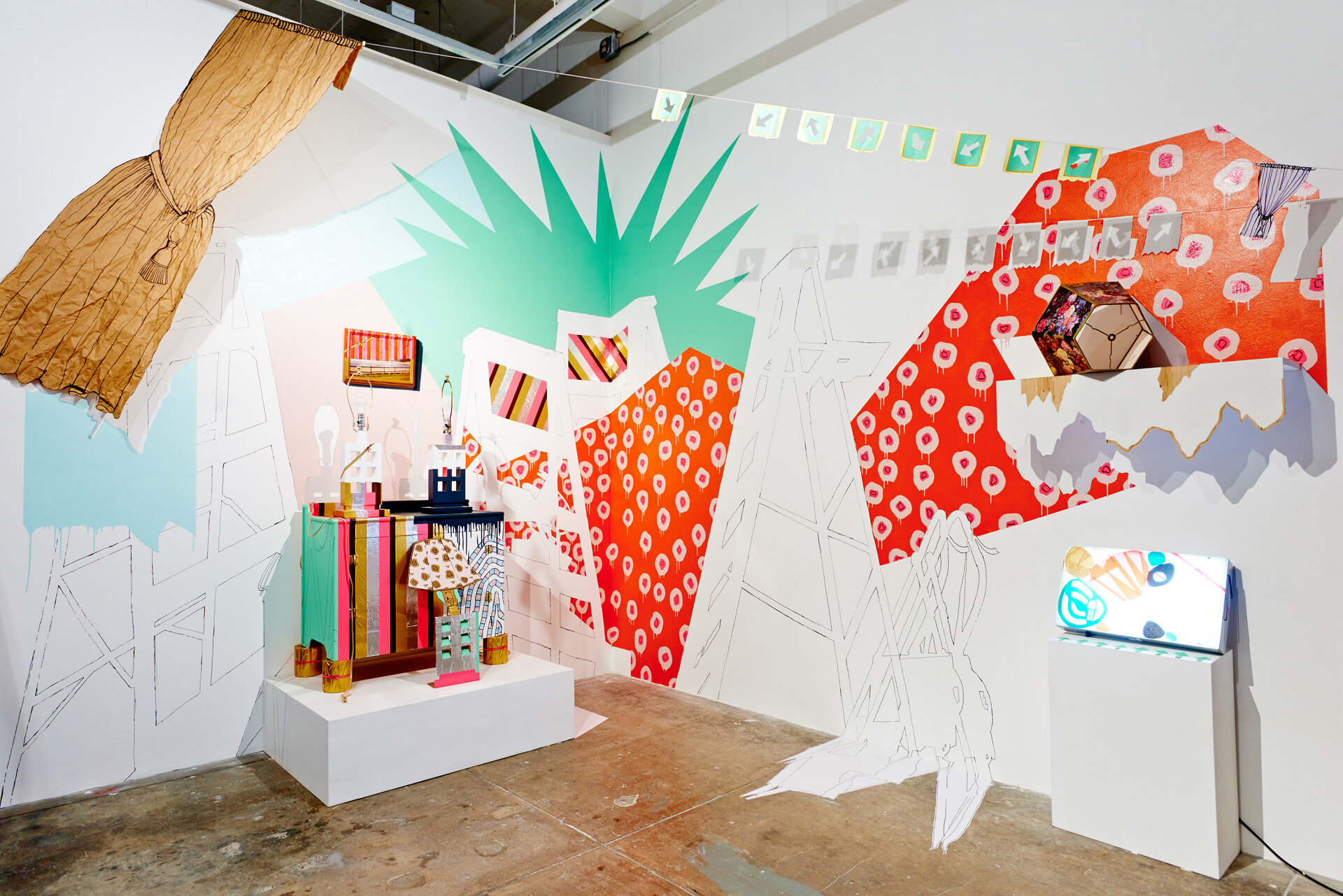
Diorama, 2020, wood, paint, mirror, lights, 89x87x24 in.
“I’ve always been attracted to work that pulls you in with a bang (usually through color or scale) and which continues to hold your attention once you’ve begun to investigate.”
Julie Alpert is an artist living and working in Tulsa, Oklahoma (USA). Her approach to color is intuitive, theatrical, nostalgic, and all about relationships (shiny vs matte; saturated vs dull; fluorescent vs earthtones). Julie’s installations, drawings, and collages are created using basic techniques from childhood arts and crafts like cutting, gluing, taping, and coloring. She almost never works from a plan, but with a set of materials and visual symbols, allowing the work to tell her where to go while she’s making it.
Julie recently created her first screen print in collaboration with Flash Flood Studios. Currently Julie is working on new installations, sculpture, and collage for an upcoming solo show at Ahha Tulsa in 2022, and a site-specific installation for Crystal Bridges Museum of American Art this fall.
Where do you reside between technical and intuitive in your work as an artist using color?
I am 95% intuitive and 5% technical, although I consider the technical choices I make as totally intuitive now, too. I have a reminder on a scrap of paper in my studio that reads “DON’T HESITATE.” When I hesitate, I think, and when I think, I overcomplicate, and it kills the work.
I’ve reached a state in my practice where I have total confidence in my body and mind’s ability to store and retrieve the technical information I need to do my work without making intellectual choices. I have a background in dance, theater and performance, so making art is a lot like improv for me. The more I can get into a rhythmic flow, the more exuberance and freedom there is in the work.
Special Occasion, 2019, wood, paint, craft paper, tape, marker, colored pencil, found objects, cardboard, 20x12x12 ft
Facebook AIR Installation, 2019, wood, paint, found objects, 25x9x1 ft
“Making art is a lot like improv for me. The more I can get into a rhythmic flow, the more exuberance and freedom there is in the work. ”
Are there specific associations towards color in your work?
The color in my work is borrowed from memories of my grandparent’s homes and my family home in suburban Silver Spring, MD. The interiors were a mishmash of color palettes and styles from the 50s, 60s, 70s and 80s and the decorations were a combination of high and low-brow collectibles. If my memory serves me, we had a faux brick linoleum kitchen floor and psychedelic avocado green wallpaper.
When I first started making art full-time I was really interested in visual tricks and illusion. I think some of that comes from the way building materials, like the faux brick linoleum, could be made to look like something it isn’t. I’ve also always been interested in fashion and clothing. I dress a lot like my work, always trying to create aesthetically surprising combinations that balance loud and subdued.
What cultural aspects of color are built into your work?
I think a lot of the color I use is specific to my childhood and adolescence as an east coast suburban American Jewish girl in the 1980s and 90s. I had a glittery puffy sticker collection, a trapper keeper, a Strawberry Shortcake bike with hot pink tassels, and mom-made frilly ballet costumes in primary colors, with crop-top and shiny cap.
Growing up just outside Washington, DC, I had access to all the amazing free museums in the city. I’m certain that early and consistent exposure to artworks from across the globe were hugely influential in how I think about art and color. I’ve always been attracted to work that pulls you in with a bang (usually through color or scale) and which continues to hold your attention once you’ve begun to investigate. That’s what I try to do with my work, too.
Lookalikes, 2014, house paint, acrylic, marker, tape, paper, vinyl, cardboard, found objects, lightbox, string, 10x16x10 ft


