Valerie Lueth/Tugboat Printshop
THE SUN, 2022, woodcut print on Japanese Paper, 47 x 37 inches.
THE SUN - in progress, 2022
“My images host a fantastic but humble embellishment of realities, my color tends to do the same.”
Valerie Lueth is an artist living and working in Pittsburgh, Pennsylvania (USA). Her approach to color is strategic and radiant, her approach to printmaking is exacting. Valerie hand-draws & hand-carves multiple woodblocks to create her printworks, laying color to paper in glowing ink layers, slowly building her imagery through deliberately stacked impressions. The meticulous linework she draws/carves direct to block translates exquisitely into woodcut. Her artworks carry a feeling of purpose that trails through their crafting to end results that feel alive on the paper.
Valerie is always in the midst of a handful of woodcut projects & participates regularly in exhibitions, features and artisan marketplaces that place value on the importance of handmade, quality objects and artworks. Valerie is alternatively known as Tugboat Printshop--the name of her self-owned print studio & online shop--where she produces & sells her original woodblock prints independently in limited edition.
Currently, Valerie has just finished carving the key woodblock for an upcoming woodcut titled "LADDER TREE", is prepping for a woodcut workshop at the Carnegie Museum of Art she'll be instructing on March 9, 2024, and has begun to pencil in another large-scale colorwork she hopes to complete in 2024.
Are there specific associations towards color in your work?
My images host a fantastic but humble embellishment of realities, my color tends to do the same.
I try to capture the glows and radiances experienced in the everyday, combinations and gradients small and subtle that shade and sculpt in effort to simulate the surround of light as it might physically wrap or illuminate an object or scene.
I want my color to liken to reality, to be believable as a sort of reality--while also twisting towards unreality, quietly & playfully questioning what ultimately is real.
LIGHTNING - in progress, 2019
CLOVER BLOSSOMS - in progress, 2019
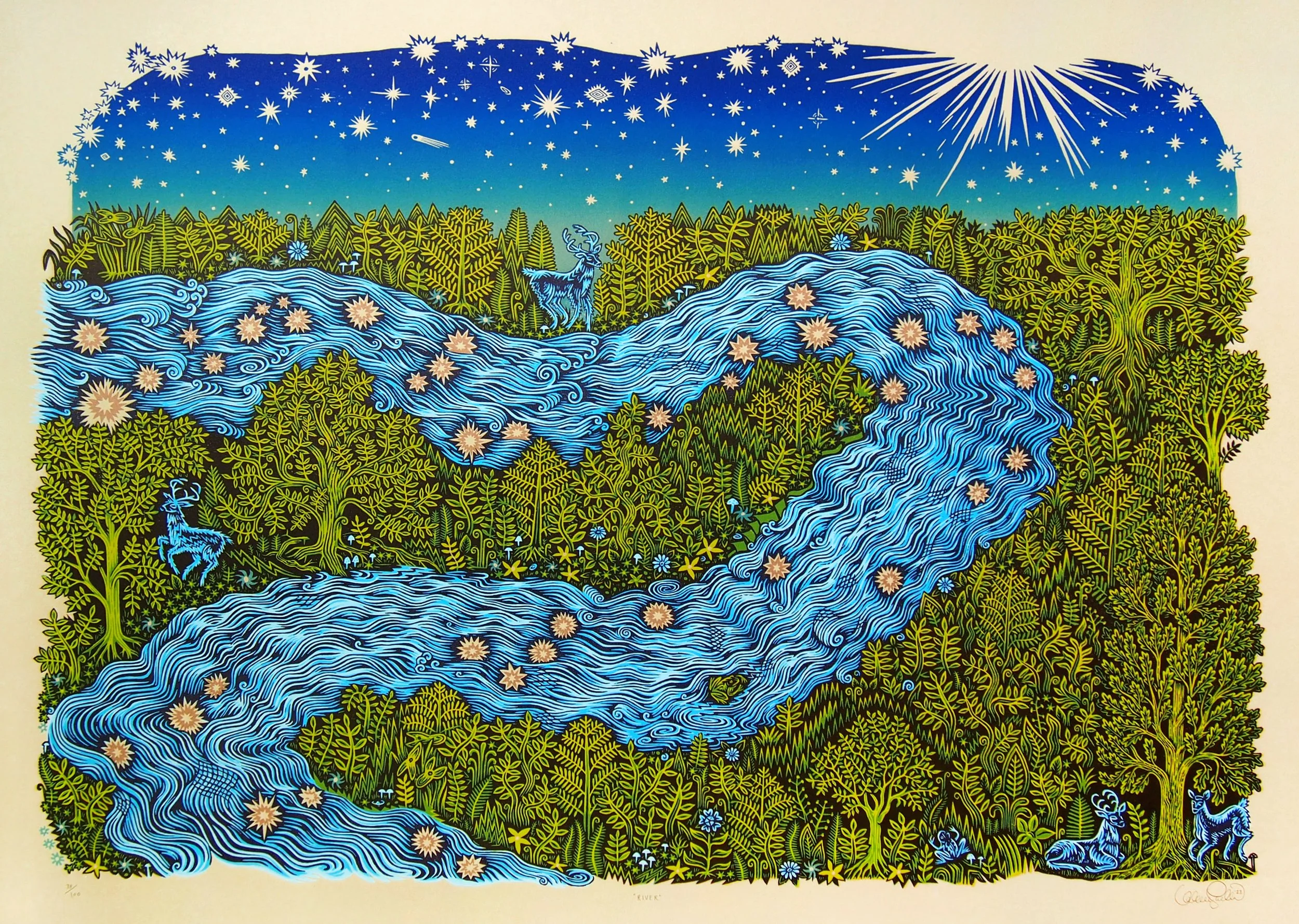
RIVER - in progress, 2023
STRING - in progress, 2023
How does the printmaking process itself relate to how you work with color?
Printmaking and its systematic approach match well with how I feel most compelled to create, with deliberation and intention. I am aware of materials as they are while I am working with them. The magic for me is how they transform through the mind and hand, from blocks of wood and tubes of ink into meticulous and transporting images on paper that bear little direct resemblance to their raw source. I love that what I spend so much time making is a matrix, created to be replicated--that the end result of my long craft is multiplicity.
The construction of my images through the impression of multiple woodblocks allows me to attempt different applications with each layer, to experiment time and time again until I get a combination that feels right for each artwork. I apply all of my colors with brayers/rollers, which lends a uniform, mechanical precision to everything hand-carved as it is printed--generating gradient and crisp edge without the direct evidence of the hand.
The stacking of these ink layers on paper is strategic and time-consuming. I set out with each piece knowing that I have the end goal of making many impressions/prints (an edition), which fuels the desire to perfect throughout the entire process of making. Allowing myself time to tinker, discover, and refine makes the whole process take longer but leads to the most interesting nuances in my work. By the time I am publishing, the woodcuts I pull up from the press feel purposeful and confident, finished.
RIVER, 2023, woodcut on tan Rives BFK paper, 24 x 33 inches
How does color represent or support the mind space of your work?
Color evokes feeling, sentiment. A piece that is black and white can certainly hold interest in what it depicts, in the flow of line and pattern. But color brings an emotional reality into an artwork, life, vivacity. I use color in my work when I want that effect, to harken reality, to bring forth a feeling of something having been in the world.
WEB, 2021, woodcut on natural Kitakata paper, 20 x 16 inches
RAINDROPS, 2023, woodcut on Kitakata paper, 19 x 12.5 inches
THE SUN - in progress, 2022
LITTLE POSSUM - in progress, 2023
What would your work be without color?
Well, I make works with and without color.
I find when I am not using color, I lean into differences in contrast more heavily. I spend more time fussing with the finesse of each line/shape/pattern and the play between what is light, what is dark. I try to balance the flow of the drawing/carving to the tension/weight I want it to hold on the page. I find that my work without color often feels slightly more cold/scientific, so images that I want to host this quality are often executed in B&W.
LITTLE POSSUM, 2023, woodcut on natural Kitakata paper, 6 x 10.5 inches.


