Michael Krueger
Most Likely You Go Your Way (I’ll Go Mine) Lithograph, 36 x 46 inches, 2012.
Published by Vermillion Editions, Amarillo, TX
“I am passionately fixed on trying to be a better observer of light. Being present in the moment as an observer is helping me to see color differently.”
Michael Krueger is an artist living and working in Lawrence, Kansas (USA). His approach to color is two fold; as a means toward depiction and as a direct route to mood enhancing. His approach to printmaking encompasses fostering an unbridled imagination within the margins of a process or technique. Michael’s work embodies an insistence on drawing, a generous and open sharing of his inner life and representational subject matter. He uses a variety of print processes in combination with a slippery use of digital technologies. His work has also manifested as animations, ceramics, paintings and collages.
Currently Michael is working on a show of new paintings and drawings that opens March 2021 at Haw Contemporary in Kansas City, MO. The new exhibit is about starting over, beginning again, and looking to plants for clues to resilience, opportunity and community. He is also working on a super-secret collage and animation project.
Where do you reside between technical and intuitive in your work as an artist using color?
Working with color can be an intuitive process, and that often seems like a good place to start, but color is also learned. I have found that my internal palette needs to be challenged and updated often. Currently, I am passionately fixed on trying to be a better observer of light. Being present in the moment as an observer is helping me to see color differently.
“Using color with printmaking is a fascinating balancing act of being as audacious as possible and exquisitely nonchalant.”
The Other Side of the Moon, (Let’s Keep It Between Us), Color Lithograph w/ glow in the dark dusting powder, 27 x 42 inches, 2018
Published by Tamarind Institute, Albuquerque, NM
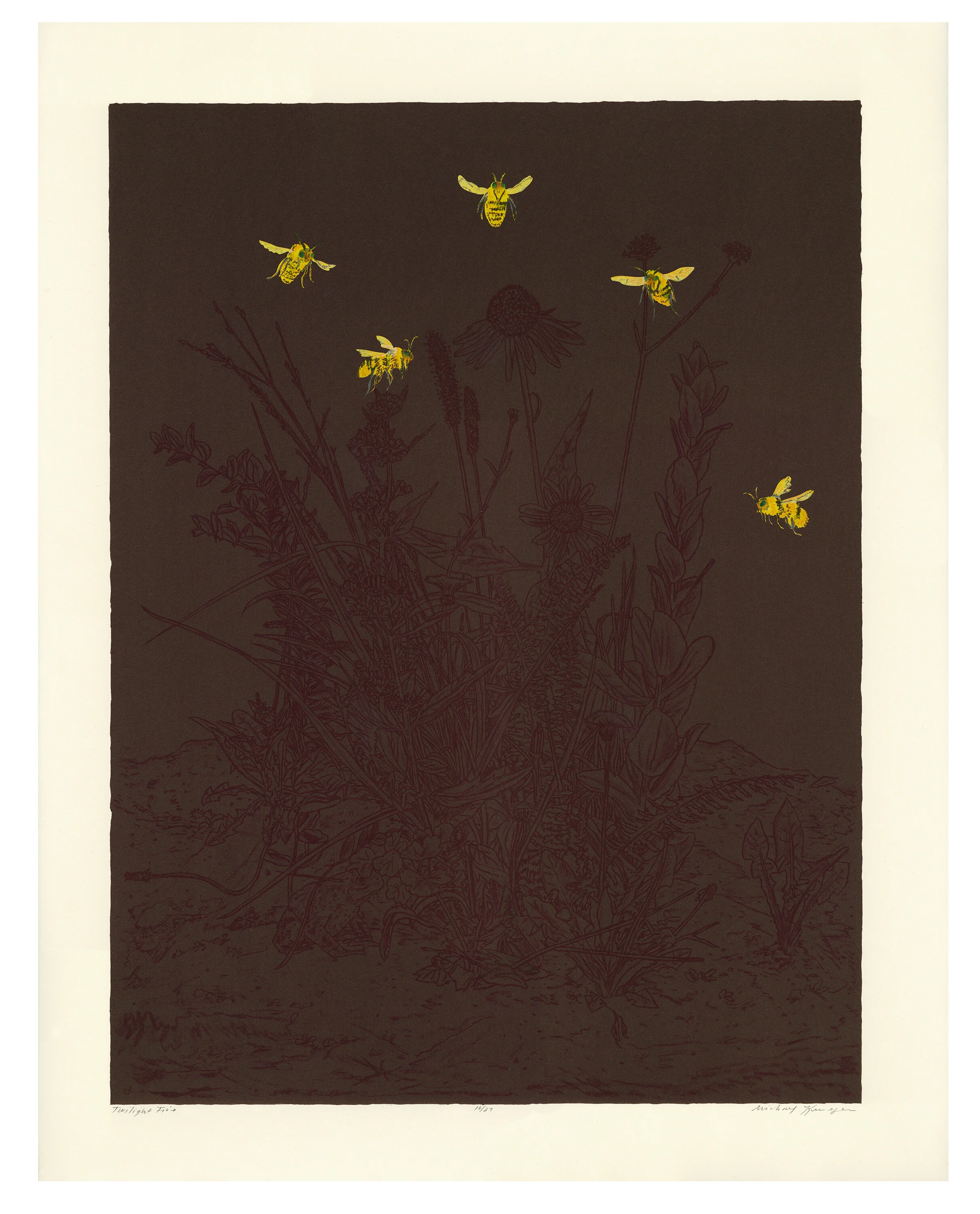
Twilight Five, lithograph, woodcut, pochoir with chine-collé, 28.5 x 22.25 inches, 2018.
Published by Lawrence Lithography Workshop, Kansas City, MO
How does color represent or support the mind space of your work?
Color is prophetic in the way it foresees emotional states, even profound states of being, the reverse is true as well, color can reach back in time to reanimate intense recollections.
There are two things that I am trying to do with color right now, the first is to use color to describe something, in the leanest terms possible, and second to use color to create an atmosphere; an ether in which several things can be true at the same time.
In all the intricates and eccentricities, in all the multitudes of grace and pain, color has a potential shade for every history, every mood, every future psyche. It gets really interesting when you begin to build content in relation to how certain colors can be attached to these potential meanings, and a palette can arise that can help to build complex multi-faceted dynamic vistas, useful mood altering spaces.
How does the printmaking process itself relate to how you work with color?
Using color with printmaking is a fascinating balancing act of being as audacious as possible and exquisitely nonchalant. Over the years I have found joy in trying to do more with less, and learning how to create complexity with fewer colors. My work looks for rewarding compromises that create a healthy balance between labor, vision and the physical presence of the final print.
I have grown to love the finality of printmaking, the striking way in which a print can simply accept no more. The graphic resoluteness of a print, through the mechanical transfer of ink on paper, achieves a unique aura; marks are unified and the ink effectuates a pristine punctuation, these qualities hold my defining interest in printmaking.
Snowy Dawn (Road to Knowhere), Woodcut, 20 x 24 inches, 2020
Published by Matrix Editions, University of Dallas, Irving, TX


