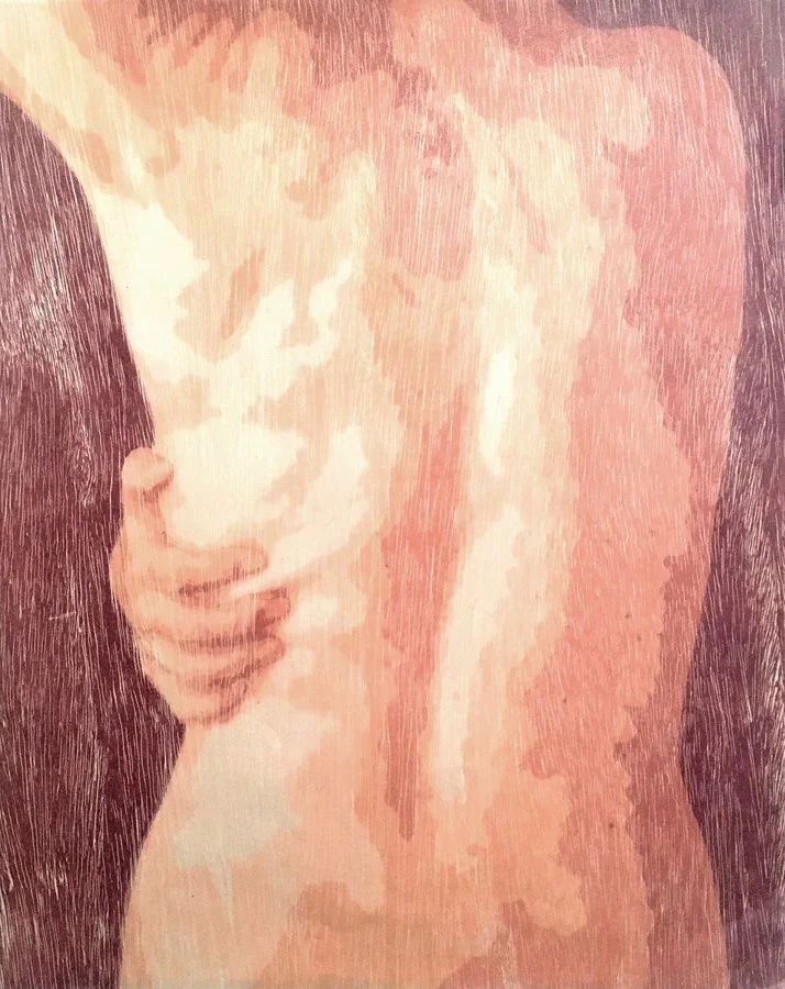
Jennifer Ghormley
Flow, site-specific installation, woodblock print on glassine, machine sewing, thread.
“I use color to brighten and enlighten everything and elevate the viewer’s mood.”
Jennifer Ghormley is an artist living and working in Denver, Colorado (USA). Her approach to color is site-specific, and she chooses her color palette based on the content or meaning of the artwork, as well as the specific audience the piece is for. Jennifer’s approach to printmaking is non-traditional and her fun, playful, engaging, unique, mysterious and unusual multiples are created with woodcut, screenprint, monoprint and trace monotype techniques. She also works with cuts, folds, pins, sewing, thread and shapes.
Currently Jennifer is working on a commission for a site-specific installation in the lobby of a building in Loveland, CO to be hung in February 2022. She is also working on drafting the plans for a large scale site-specific installation to be hung in the Denver International Airport Fall 2022. Jennifer also runs a small business printing products which she sells at art and craft fairs.
Are there specific associations towards color in your work?
For my personal work of the figure, I choose fleshy colors to resemble skin and the body, as well as symbolic colors such as red for pain or blood, and blue for calm/serenity and also an association with nature and the big open sky.
In creating work for the site-specific installations, sometimes I pull from other colors in the location or from the interior designer’s palette. If none of these are options, lately I have been on a blue/teal streak, which to me is a reflection of water, sky, and birds in flight. My earlier work in undergrad referenced the women’s history in my family through simple, drab colors, as there has been much hardship in the past. I went through my feminist phase in grad school where everything was blood red and angry, lots of ‘yonic’ imagery. Now I use color to brighten and enlighten everything and elevate the viewer’s mood. The majority of my current print work is of landscape and mountains, so its fun to print nature in happy bright colors like purple, pink, blue, and green.
Fresh, site-specific installation, fabric, thread, pins.
Fresh, site-specific installation, fabric, thread, pins (detail).
Fresh, site-specific installation, fabric, thread, pins (detail).
What can printmaking ink achieve regarding color in your work that no other material can?
I absolutely LOVE the Handschy / Hanco oil-based litho inks, they are such rich, deep colors, and very vibrant. I enjoy mixing the ink, feelings the tack on the palette knife, mixing new colors, and I super love the smell of the inks.
I also utilize transparent base to change the value of the colors, play with overlapping transparent colors, and love to implement the atmospheric fade look. I am sure watercolor could achieve a similar effect, but I enjoy rolling out the ink slab, rolling it onto a textured woodblock, cranking the press wheel, and the sometimes surprise of how the print looks. Screenprinting is exciting too, also enjoy utilizing the transparent base, and Speedball makes some glittery inks that have been super fun to play around with.
Untitled series (Pose 3, 4, 5), woodblock, screenprint, paper plate litho, printed on fabric and paper.
Untitled series (Pose 3, 4, 5), woodblock, screenprint, paper plate litho, printed on fabric and paper.
What would your work be without color?
Bland and sad, nearly non-existent…
Untitled series (Pose 3, 4, 5), woodblock, screenprint, paper plate litho, printed on fabric and paper.


