Jason Urban and Leslie Mutchler
AGS Aura Altar (Green to Red-Orange), Inkjet Print on Phototex, MDF Plinth with Paint, Rocks, Acrylic, JULM Zener Deck, & Phototex, 144” x 144” x 60”, 2021. Installed at The Delaware Contemporary in Wilmington, DE.
“The way color is seen and interpreted has been so informed by (often misguided) biases and social norms. Our work uses both facts and fictions of color but comes from an impulse that is playful and curious.”
Jason Urban and Leslie Mutchler are collaborators living and working in Brooklyn, NY. Their approach to color is ever-evolving and their approach to printmaking is expansive and multi-disciplinary. Their project-based, research-intensive work is created with a wide variety of analog and digital printmaking techniques. They are developing a body of work called Geochromatics, an open-ended inquiry into color and its representation in science, pseudo-science, and the spiritual.
Currently, Leslie and Jason have a solo exhibition up through May at the Delaware Contemporary and they are working on another for later this year at the Center for Book Arts in Manhattan. They are also completing a residency at Dieu Donne paper making studio that was postponed from 2020 due to the pandemic.
“We were interested in raw materials that get processed for use in printing- [like how] magnesite is processed into magnesium carbonate for lithography. We’ve engaged with a broader study in pigments and the origins of color in geology. ”
Circles in Circles (108 Verdigris), Flour, Salt, Pigment, and String, 2020.
What are the direct references, research, or aspects of history that your work includes?
Perhaps because of our background as printmakers, many of our projects start by mining archives and second hand sources- printed matter and ephemera. Regardless of topic, we begin at the library. We’ve been fortunate in that we’ve been based in library-rich places: we spent a decade at the University of Texas at Austin which had a huge network of research libraries and now we’re in New York City which also has an amazing density of libraries.
For our most recent work that focuses on color, in addition to the Pratt Libraries collection, we’ve made a pilgrimage to the Faber Birren Color Collection at Yale University to dig through and photograph historical texts. The degree to which conjecture and supposition is passed off as “science” in many classic color texts is eye-opening but perhaps not surprising. Birren, Munsell, Itten… the way color is seen and interpreted has been so informed by (often misguided) biases and social norms. Our work uses both facts and fictions of color but comes from an impulse that is playful and curious.
Geochromatic Readers, Offset Books w/ Pigment Print Jackets, 8”x5”x1/2” each, 2020.
How does the printmaking process itself relate to how you work with color?
For a long time, we focused on CMYK as a starting point when our work engaged with color. Coming from a print background, it always seemed like a logical default. Cyan, Magenta, Yellow and Black made for an easy palette with clear associations to the history of printed matter.
More recently, we’ve been viewing color through a material lens. We’ve been focused on how color exists in the physical world. We did a show in Montreal many years ago where, as part of a larger inquiry, we bought a big chunk of magnesite from an eBay seller in Nevada. We were interested in raw materials that get processed for use in printing- in this case, magnesite is processed into magnesium carbonate for lithography. Since that exhibition we’ve engaged with a broader study in pigments and the origins of color in geology. We’ve been exploring this relationship explicitly in our Geochromatics series.
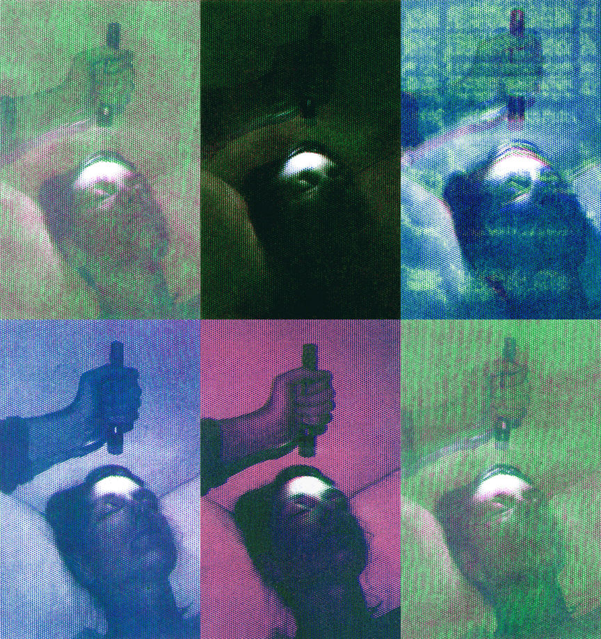
Analogue Color Therapy (Birren), Risographic Video (00:00:14), 2020.
Intermediate Geochromatic Studies, Phototex, Handmade Paper with Collage and Pulp Paint in Frames, Digital Print on Foamcore, MDF Plinth, Latex Paint, and Offset Publications, 2020. Installed at NARS Foundation in Brooklyn, NY.
Long Lost Friend, Inkjet Print on Paper & Phototex, UV Print on Aluminim, & Wood, Dimensions Variable, 2019. Installed at The Print Center in Philadelphia, PA.
Are there specific associations towards color in your work?
Color can be thought of as a crossover field of study in that it impacts and is informed by many different disciplines. With that in mind, we’ve been trying quite consciously to mash-up a broad range of color influences into our work- from traditional color theory to color in science, pseudo-science, and the spiritual. Our installations often consciously consider the way color operates in digital spaces in contrast to analog spaces.
As artists, we try to follow tangents. We read lots of foundational texts related to color theory but at the same time we’re investigating how color is utilized in more cerebral and intuitive ways as part of homeopathy and spirituality. Sometimes we end up down rabbit holes that dead end but other times things open up into whole new realms. As artists, we don’t feel that it’s our responsibility to arrive at answers so much as ask questions.
Circles in Circles (108 Another Spectrum), Flour, Salt, Pigment, and String, 2020.


