Hilary Lorenz
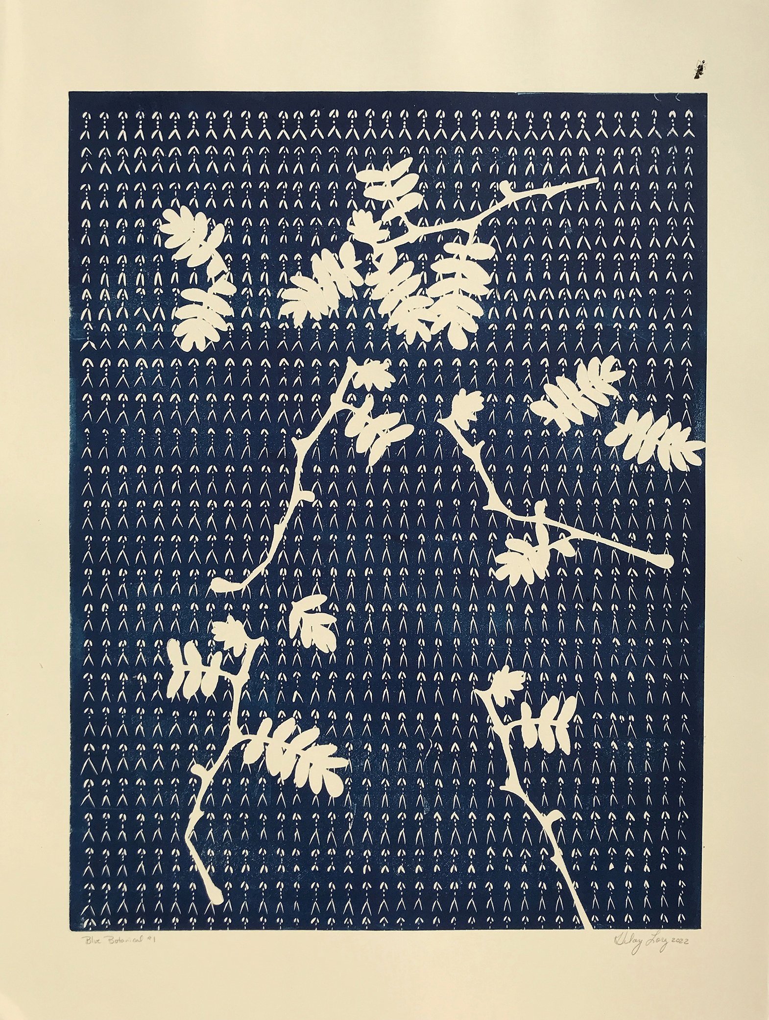
Blue Botanical 1, 2022, relief print, 30 x 22 inches. (Series of linocuts with botanic paper stencils of purslane which grows wild on Hilary’s NM land.)
“My true love is the physicality and force that carving creates. I highlight that visual energy by eliminating layers and color.”
Hilary Lorenz is an artist living and working in Abiquiu, New Mexico (USA) and in remote wilderness cabins whenever invited. Her approach to color is informed by her environment and process. Hilary's approach to printmaking is physical and direct, and her bold, expressive work is created with relief printmaking, marbling, collage, and watercolor drawings. Her large-scale linoleum block printed and cut paper installations are derived from her physical exploration and relationship with the natural world.
Hilary recently exhibited her crowd-sourced printed and cut paper installation, The Moth Migration Project, at the Denver Botanic Garden. Hilary's other current project is to hunker down into her rural New Mexico studio after living thirty years in NYC to see where this high desert landscape will take her artwork. She knows it will include a series of woodcut prints investigating water.
How does the printmaking process itself relate to how you work with color?
Early in my printmaking education, I was totally turned on by the German Expressionists; Kollwitz, Kirchner, Heckel, Schmidt-Rottluff, Nolde, and others. Their prints were aggressive, stark, direct, and straightforward. They appeared rough, flat, and intense.
My first prints were intaglio, but then I moved into woodcuts. I used found wood which has a history. I liked the scars it inherently came with. I wanted to beat up the wood with physical force. Later in my career, with the recommendation of a colleague, I started using a chainsaw to "carve" large 4' x 4' and 4' x 8' blocks. Now that is fun.
The problem was in having a press to print these larger blocks, as I do not like hand printing. The other thing I keep from that early influence is the image economy. I may be carving images of mountains, waterfalls, animals, but I have no interest in illustrating them; in fact, I like to leave a lot out so the viewer can create their own story and their eye can complete the picture. I am more interested in energy than portraying a particular subject, even when that subject is obvious.
Transitions, 2022, linocut, 30 x 22 inches.
Blue Botanical 6, 2022, relief print, 30 x 22 inches.
How does color represent or support the mind space of your work?
I have two different mind spaces when it comes to color. In printmaking, I use black or dark blue ink. It does not matter if I am using relief, intaglio, or litho. But when I draw with watercolor, my palette is an expanse of blue, green, white, red, and orange.
My primary printmaking process is linoleum block printing. With lino, I focus on creating a dynamic quality in my carving. While carving, I habitually count my cutting strokes; I also often recall a hike or run and equate the repetitive carving stokes with my footfalls.
My focus is on the power of the line, and to reveal that, I require black ink. Alternatively, I rely on layers of saturated colors to enact that same energy with a watercolor drawing. My true love is the physicality and force that carving creates. I highlight that visual energy by eliminating layers and color.
“I like to leave a lot out so the viewer can create their own story and their eye can complete the picture.”
What would your work be without color?
I might be better off if I only had black ink, a brayer, carving tools, and paper.
When I look out my studio door to the rocks, sand, and tumbleweed, the landscape is predominately brown, but incredible lines, shapes, and movement are within that brown. I could make a whole library of these textures and print what is right in front of me. I can easily get paralyzed by an overabundance of choice, which may be why I use only one color in my prints.
I recently left NYC to live in rural Northern New Mexico. I am far from modern conveniences that eliminate distractions and impose limitations. When I have limits, I can focus on the image without worrying about how color will add or distract from that. I now work with what I have on-site, making my art practice incredibly expansive.
Blue Botanical 14, 2022, relief print, 30 x 22 inches.
Blue Botanical 3, 2022, relief print, 30 x 22 inches.


