Anne Burton
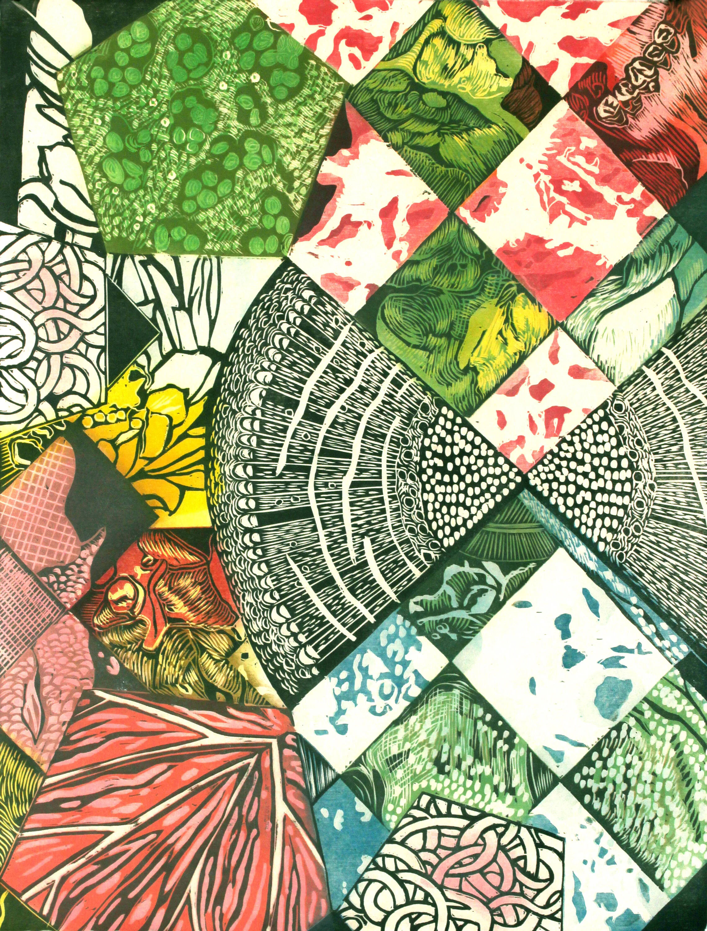
Surgery Quilt #2, reduction woodcut on Japanese paper, 22" x 17", 2019
“Printmaking can create color that has depth and flatness at the same time. The color can be inside of the paper, but also create the illusion of real space.”
Anne Burton is an artist living and working in Lincoln, Nebraska (USA). Her approach to color is intuitive and her approach to printmaking involves many layers of atmospheric color and pattern. Anne’s intricate and vivid work is created with woodcut, screenprint, intaglio, letterpress and pochoir printmaking techniques.
Anne usually begins with small scale models that look a lot like shadow boxes. This helps her achieve the look of shallow depth in the print. She create the shadow boxes from her own drawings or cut up prints and other printed ephemera she collects. She places the photographs of the models into illustrator or Procreate and draws on them to finalize the designs for her prints.
Currently Anne is working on a body of work called Inhaling the Spore. This work explores her personal experience with her son’s illness, hospitalization and surgery. On a broader level, the work is about how we think about illness, how we relate to our environment and the parent’s role as a child’s advocate. Anne says, “My son became ill and developed a tumor after inhaling a rare form of mycobacterium while playing in the dirt. I started to see the act of inhaling a spore as an apt metaphor for swift changes. This is even more relevant to me now as we all live through the much more pervasive illness of Covid-19. I’m currently working on a large commission of pieces for the new surgical wing of the hospital where my son had his surgery – an interesting full circle for this body of work to return to where it started.”
Where do you reside between technical and intuitive in your work as an artist using color?
I always begin with a full color mockup of my prints and then end up deviating from it quite a bit. I enjoy the process of responding to the way the colors blend and improvising the textures, carving and blending on the block. I often blend and even carve on the press bed, making changes as I work. My colors rarely end up the same as the colors in my draft.
August's Crazy Quilt, reduction woodcut on Japanese paper, Commission in progress for Children's Hospital and Medical Center, Omaha, NE, 3' x 7.5'
Surgery Quilt #1, reduction woodcut on Japanese paper, 22" x 17", 2019
Are there specific associations towards color in your work?
Many of the colors in my work come directly from kitschy objects and printed ephemera from the 1950s and 60s and I really love the color palettes used in that time period, as well as the color separation and patterns used in the printed materials I collect. The limited color palette of old greeting cards, posters, paper dolls and illustrations has always been very appealing to me, and I have a large collection of these I have worked with over the years in my work.
What can printmaking ink achieve regarding color in your work that no other material can?
Printmaking can create color that has depth and flatness at the same time. The color can be inside of the paper, but also create the illusion of real space. That tension is something I enjoy exploring in my work.
“My colors rarely end up the same as the colors in my draft.”
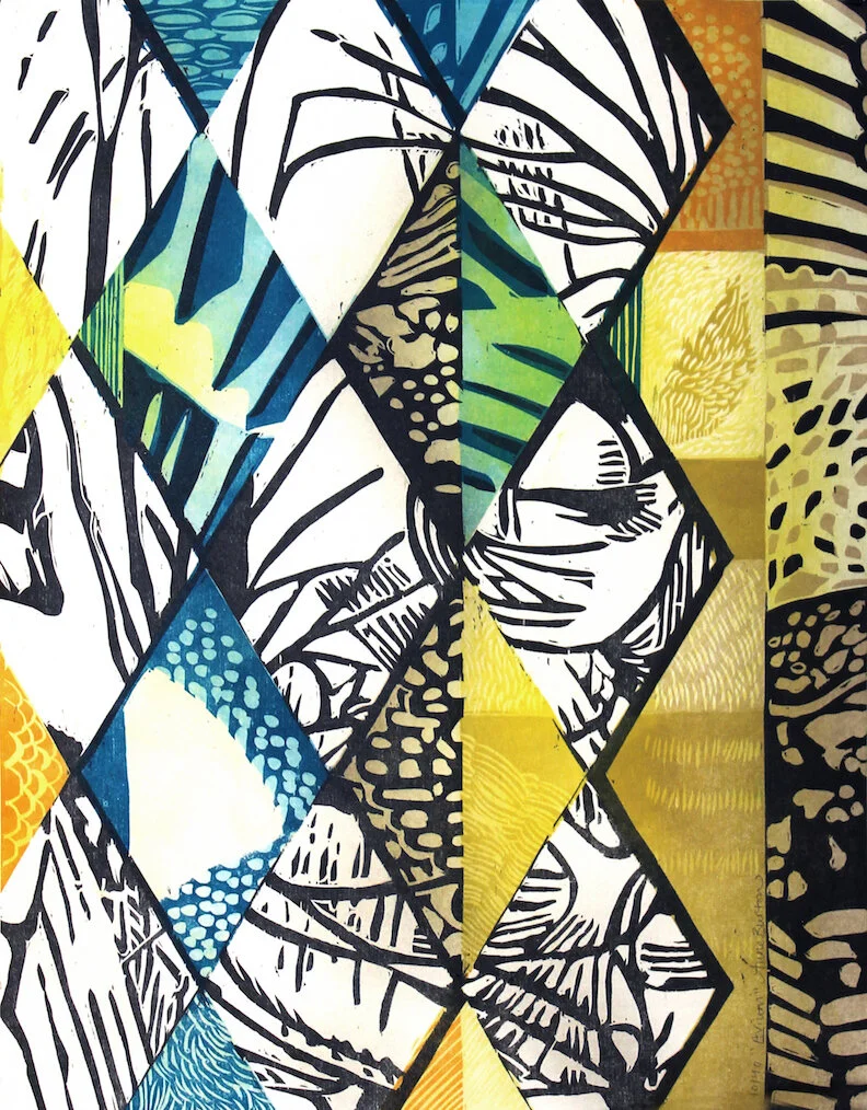
Avium, reduction woodcut on Japanese paper, 14" x 11", 2020


